
Event Registration Form Best Practices
Every field on a registration form costs 1–3% in conversions. Learn which fields to include, question order, and mobile optimization to boost conversions.
August 25, 2026
Your registration form is a conversion funnel. Every extra field you add increases the chance someone abandons it. Every confusing label increases drop-off. A well-designed form converts 40–60% of visitors; a poorly designed form converts 10–20%. That difference is significant. The key is asking only essential questions, ordering them strategically, and optimizing for mobile devices where 60–70% of registrations happen.
The Data You Actually Need
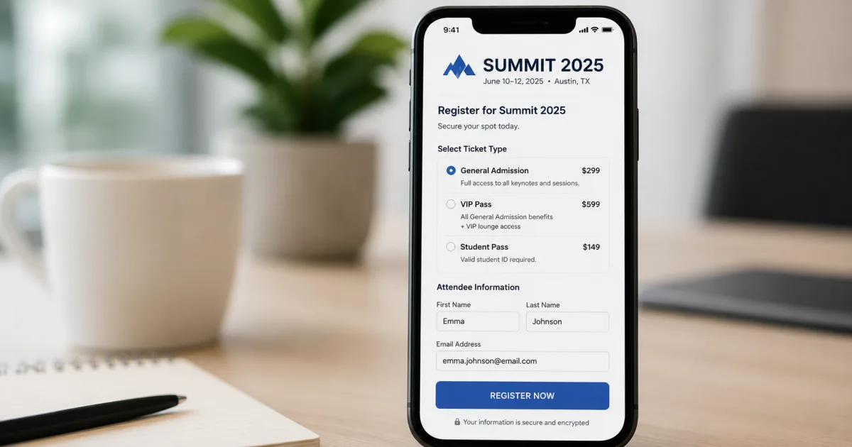
Start with the bare minimum: name, email, and ticket type.
Mandatory:
- Name (first and last)
- Email address
- Ticket type
Nice to have, but causes friction:
- Company name
- Job title
- Country/state
- Dietary restrictions
- Accessibility needs
- T-shirt size
- Session preferences
Every field you add drops conversion rates by 1–3%. If 100 people visit and 40 convert (40%), and you add three fields, expect 37 conversions.
The question to ask: "Do I absolutely need this to run the event?" If no, make it optional or cut it.
Mandatory vs. Optional Fields
Make your form structure clear: show which fields are required.
Visual indicators: Use an asterisk (*) for required fields and label optional fields with "(optional)".
Progressive profiling: Ask mandatory questions first. Once they've committed to a ticket, ask for company, job title, dietary preferences.
Smart defaults: If most attendees are from the US, default to US. Let them change it. Saves time.
Question Order and Sequencing
The order of questions affects completion rates.
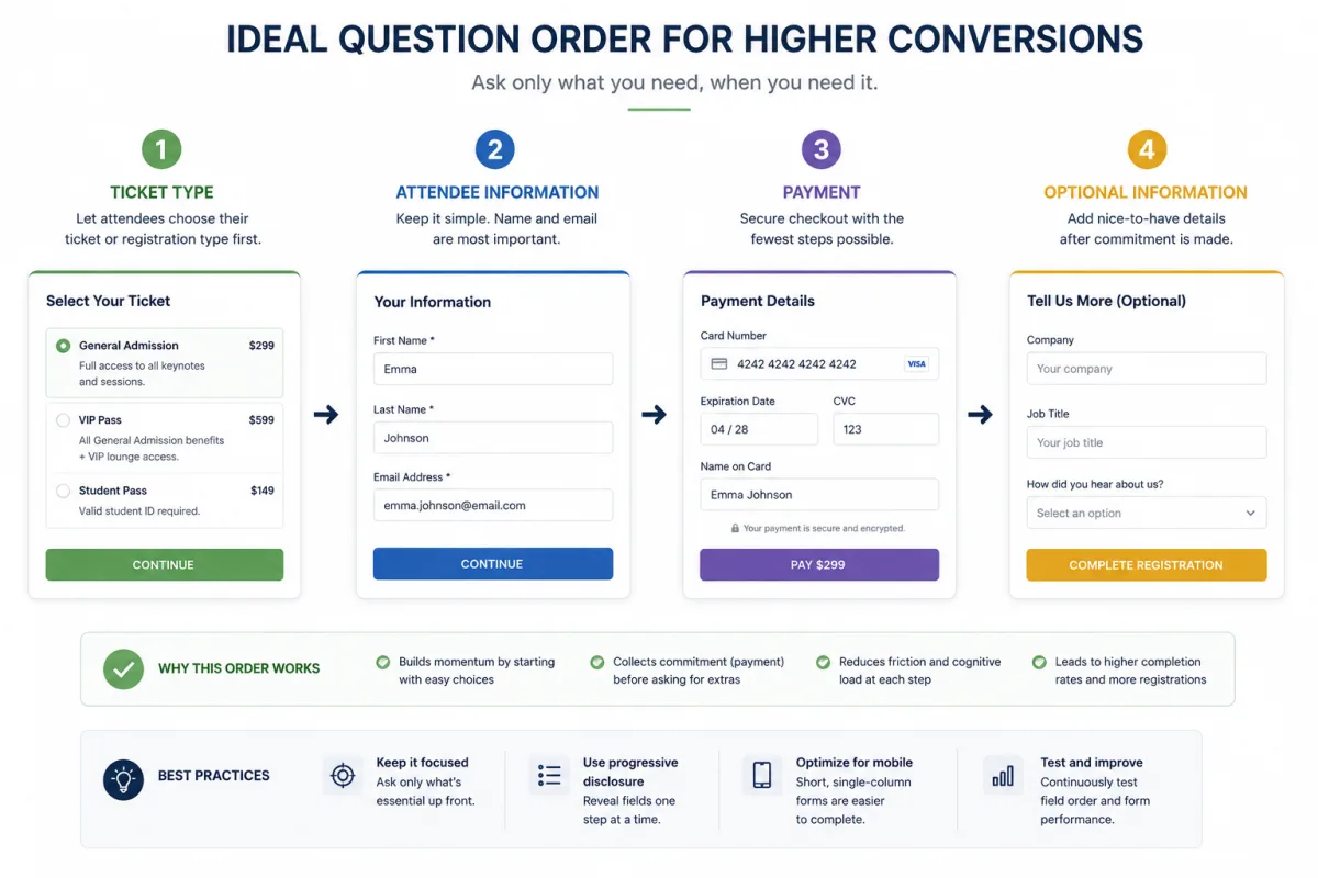
Lead with the value:
- Event title and date
- Ticket type selection (early-bird pricing, standard, VIP, etc.)
- Name and email
- Payment
Only after payment ask for company, job title, dietary restrictions. For pricing strategy guidance, see early bird pricing strategies.
Progress bar: For long forms, show "Step 1 of 3: Choose your ticket" → "Step 2 of 3: Your info" → "Step 3 of 3: Confirm."
Group related questions: Put dietary restrictions and accessibility needs in a single "Special requests" section.
Conditional Logic to Reduce Friction
Show question X only if they answered Y.
Example: Show dietary restrictions only if the event includes catering.
Example: Show session preferences only if multi-track conference.
Example: Show "promotional emails?" only for free tier registrants.
Conditional logic requires a registration platform that supports it. Most modern platforms do.
Mobile-First Design
Most registrations happen on mobile phones (60–70%).
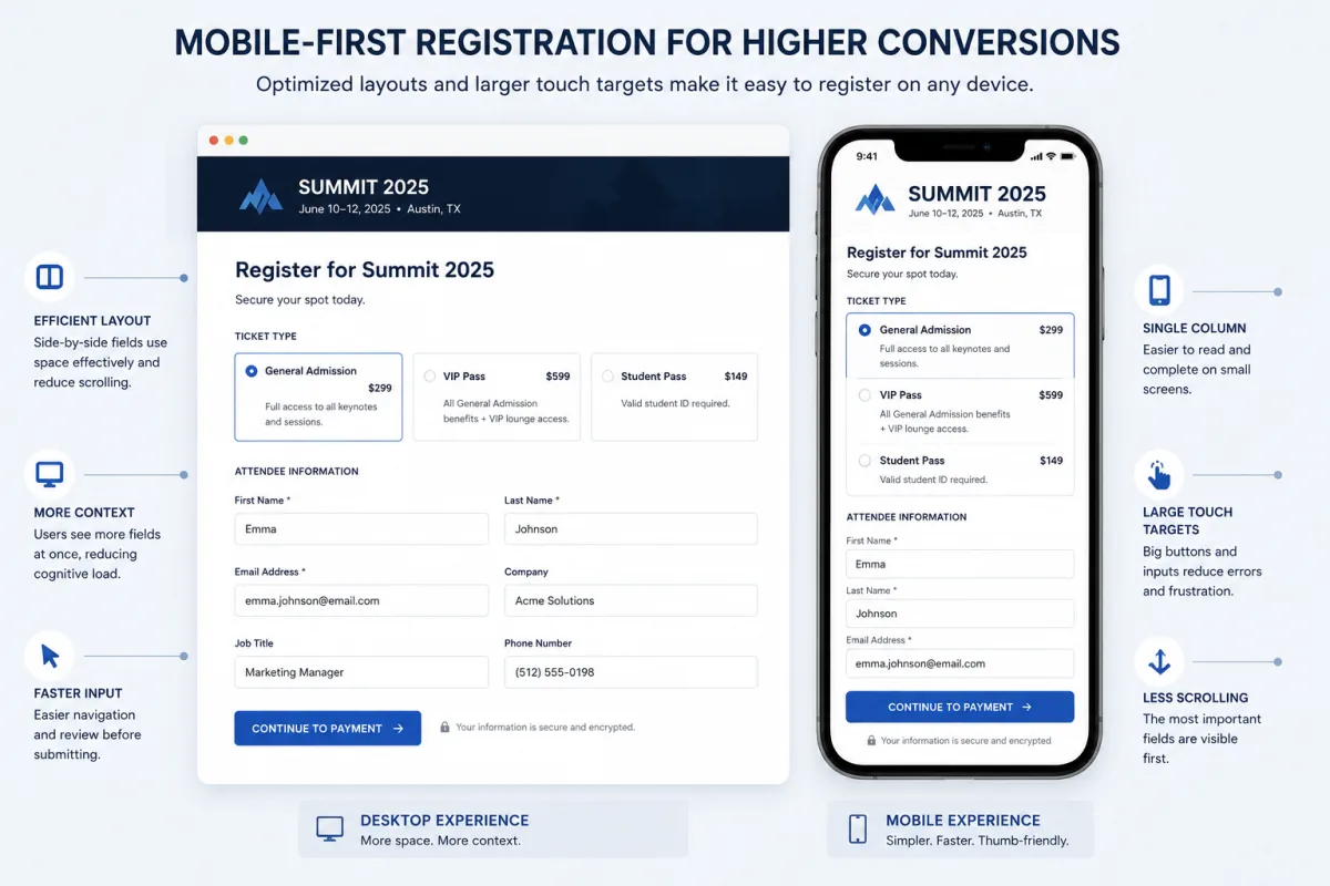
Mobile best practices:
- Single-column layout
- Large input fields (minimum 44×44 px)
- Full-width submit buttons
- Minimal typing (dropdowns for common options)
- Autofocus on input fields
- Mobile keyboard optimization (type="email" for email fields)
- Fast load time
Test your form on actual phones before launch.
Conference Registration
Registration that feeds check-in, badges and reporting
Custom forms, group bookings, discounts and invoicing, with every registrant flowing straight into check-in and reporting.
Payment Integration
Single-page checkout: Ticket selection, personal info, and payment all on one page. Highest conversion, more complex integration.
Multi-step checkout: Personal info on one page, then redirect to payment page (Stripe, PayPal). Slightly lower conversion, easier to implement.
Post-registration payment: Register first, pay later. Works for B2B, not ideal for consumer events.
For most events, single-page checkout or immediate redirect-to-payment is best.
Clarity in Labels and Instructions
Confusing field labels cause people to skip or fill in wrong data.
Clear labels:
- Instead of "Affiliation," use "Company name"
- Instead of "Designation," use "Job title"
- Instead of "Dietary restrictions," use "Do you have dietary restrictions?"
Instructions: "Job title: Your role at your company (e.g., Product Manager, CEO)"
Field-level validation: Show "Please enter a valid email address" immediately if they make a mistake.
Accessibility Standards
Your form should be usable by people with disabilities.
Labels linked to inputs: Every input needs a label. Use the <label> HTML tag.
Color is not the only indicator: Don't use red color alone for errors. Add an icon or text.
Keyboard-only navigation: Tab through fields. Confirm focus is visible.
ARIA attributes: Add aria-required="true" to required fields. Add aria-describedby for error messages.
Color contrast: Text and inputs need high contrast. Aim for 4.5:1.
Confirmation and Next Steps
After registration, what do people see?
Confirmation screen: "You're registered! Your ticket confirmation is being sent to your email."
Confirmation email: Send immediately with:
- Event date, time, location
- Ticket type
- Calendar invite
- Link to attendee app
- Clear next steps
- QR code for mobile ticket
Attendee portal access: Give them immediate access to speakers, agenda, session selection.
Poor confirmation is a missed opportunity. A clear email reduces day-of questions and no-shows. See the guide to reducing no-shows for additional confirmation and reminder tactics.
Running Registration Forms with VenueSight
VenueSight's form builder lets you design without coding.
Workflow:
- Choose fields to include
- Set which are required
- Add conditional logic
- Customize thank-you email
- Publish
VenueSight's form is mobile-optimized and accessible. Payment is PCI-compliant. Data captured in your event database.
You can also set up pre-registration forms (early-bird) and wait-list forms.